I often wonder how my horses view me and the world around them. What colors do they see? In addition to how they see color, how well do they see contrast between light and dark? How well can they see at night? How much of the visible world do they take in? How do course designers use colors and depth perceptions to set safe, but challenging courses?
I decided to tackle these questions.
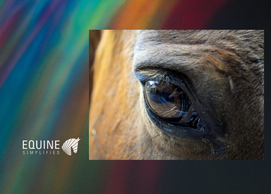
Let’s begin with the eye.
In all, we still do not know exactly what horses can see and researchers are actively tackling that mystery. However, we have some key hypotheses that potentially give us insight into how our horses see the world:
Horses have laterally placed eyes which can provide monocular vision independently. This gives them the ability to have a wider span for spotting predators.
It appears that horses possess the ability to judge distance at high speed. This makes sense from a flight perspective and allows them to move quickly to escape danger. It also bodes well to the activities that we have with our horses where we ask them to judge distances while in motion.
Horses have excellent focus on distant objects but have more difficulty focusing on objects less than 3 feet away.
Horses have the ability to cope better in low light than the human eye.
Horses appear to have dichromatic vision, (meaning they can see only two of the three primary colors). Thus, while horses can see colors along a continuous range from blue to yellow, they do not see reds, oranges, and greens in the same way humans see them.
Horses have a broad focus on “everything” vs focusing on specific targets.
What might colors look like to horses?
Do you think your horse may spook at bright colors like orange and red? Well, think again. As mentioned previously, the dichromatic vision hypothesized for horses means that they can not see bright colors like red, orange, and green. Scientists suggest the following spectrum is how horses see colors versus humans.
Carroll, J., C.J. Murphy, M. Neitz, J.N. Ver Hoeve, and J. Neitz. 2001. Photopigment basis for dichromatic color vision in the horse. Journal of Vision 1:80-87.
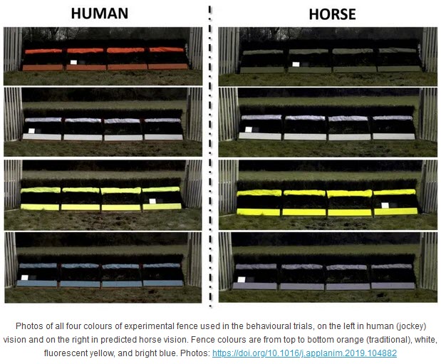
In one research study, researchers spread out various colored water buckets equidistant along a fence and monitored water intake. The graphic below shows the horses’ color preferences. Further, horses selected blues over other colors and light-toned colors over darker tones.
Their findings coincide with the preferences above based on visibility. White, blues and yellows offer the best visibility for the horse in contrast with a darker background. Colors that humans see vibrantly like orange, blend in as grays to horses. The image below comes from their findings.
Using knowledge of the horses sight in course design
Course designers use their knowledge about how the horses see both depth perception and colors to design challenging courses. While safety is always the initial consideration, using various materials, colors, and strategic locations can offer interesting challenges to horses.
In the research by Ms. Paul and Mr. Stevens, in addition to color perception, they also found that color impacted the location where horses took off for the jump. White fences offered the largest takeoff distances. Also, white fences that get dirty over time could reduce the visibility of the fence.
In the Plaid Horse Plaidcast, Eric Hasbrouck talks about how he uses all of these tools to plan FEI level show jumping courses. One of the notes that I came away with is how he used the rail going around the ring to give a perception question to the horses on course. This, coupled with the coloring and strategic placement of the fence, may cause horses to knock rails.
Does this change how you interact with your horses?
So, all this time, you may have chosen a halter, leadrope, saddle pad, or boots based on a color you like or a color that matches well with your horse. Will you consider changing them to one of the preferred colors above? Personally all my colors are fairly neutral anyhow with leather halters, black leads, black polo wraps and white baby pads…so I will not be changing any of these.
The compelling item for me was finding bucket colors that promote horses to drink well. I have black buckets, and never thought that a color may promote drinking. It is certainly something to think about in the future if I have a situation with a horse that does not drink enough water.
Finally, I do now look at jumps differently. I think about the use of colors and the contrast with the other jump materials and background. With having young horses, I want to make sure that we use jump colors to build confidence so that every experience is a positive one.
We use cookies on our website to give you the most relevant experience by remembering your preferences and repeat visits. By clicking “Accept”, you consent to the use of ALL the cookies.
This website uses cookies to improve your experience while you navigate through the website. Out of these, the cookies that are categorized as necessary are stored on your browser as they are essential for the working of basic functionalities of the website. We also use third-party cookies that help us analyze and understand how you use this website. These cookies will be stored in your browser only with your consent. You also have the option to opt-out of these cookies. But opting out of some of these cookies may affect your browsing experience.
Necessary cookies are absolutely essential for the website to function properly. This category only includes cookies that ensures basic functionalities and security features of the website. These cookies do not store any personal information.
Any cookies that may not be particularly necessary for the website to function and is used specifically to collect user personal data via analytics, ads, other embedded contents are termed as non-necessary cookies. It is mandatory to procure user consent prior to running these cookies on your website.